This guide will walk you through the process of adding a card component to your page using the Page Editor. Cards are a versatile way to present information in a clean, structured, and visually appealing format.
With the Page Editor, you can quickly add a new card, update its text, insert images, adjust layout options, and link it to relevant pages or forms. Cards help improve readability and make important content stand out.
Follow the steps below to learn how to create and customise cards to enhance your page design.
Finding the Page Editor
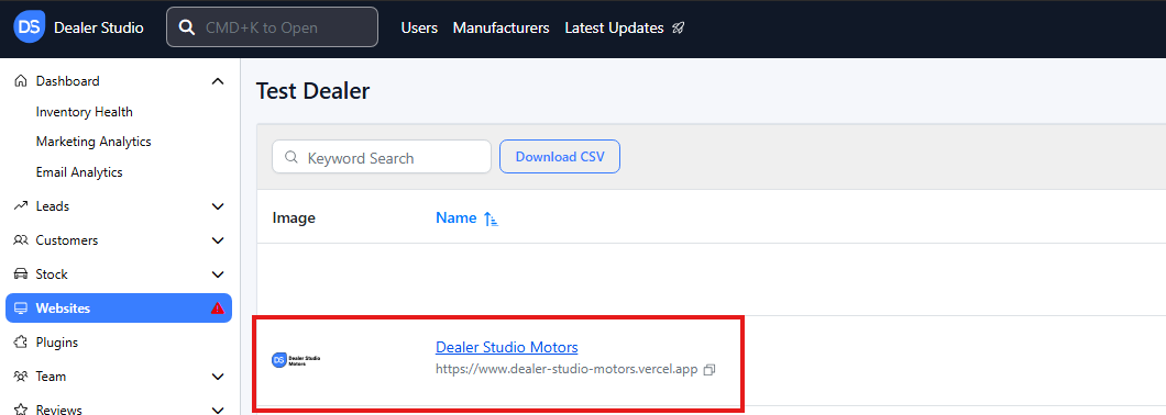
Step 1: On the Dealership Dashboard, select Websites
Step 2: Select the desired website to edit
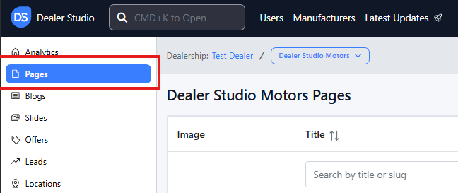
Step 3: Once on the Website Dashboard, select Pages
Step 4: Select the page you want to edit

Adding and Editing Existing Cards on Your Pages
-
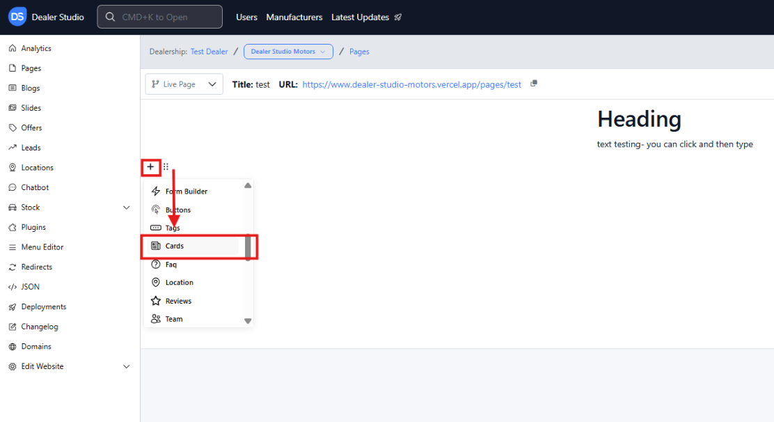
Navigate to the desired area of the page. Hover your mouse over the left-hand side until the + icon appears. Click on the icon, then scroll down and select the Cards button.
-
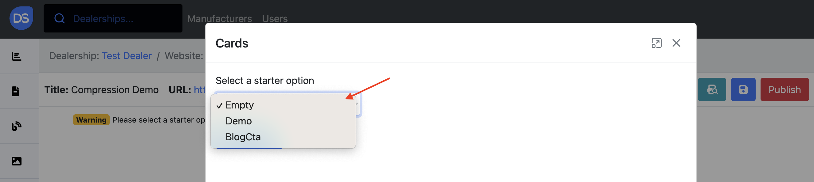
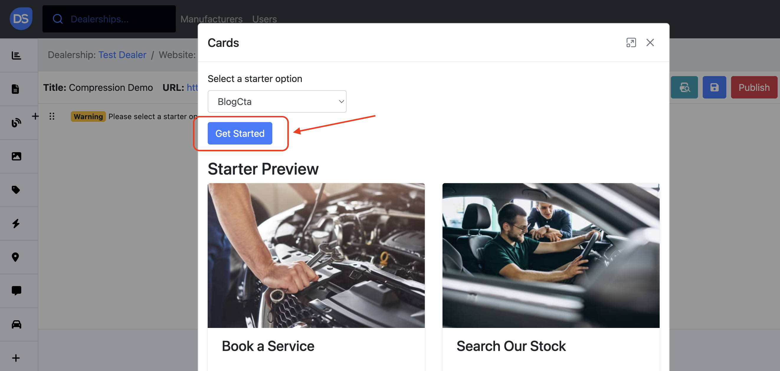
When adding a card, you'll first need to choose a template.
You can select one of the following options from a dropdown menu:
-
Empty: Start with a blank slate and design your card from scratch.
-
Demo: A pre-designed card with placeholder content. This is useful for quickly getting started or testing different card layouts.
-
BlogCta: A specialised card design for promoting blog posts or content with a call to action (CTA) button.
You can preview each option by clicking on each drop-down option before selecting Get Started:
How to Design a Card
When selecting Demo or BlogCta options, a template will appear pre-filled which can be adjusted to your needs. When selecting Empty, you will be directed to a blank template to complete.
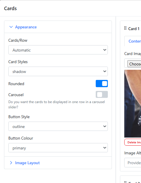
Before editing or adding a card, you will be asked to design your cards with the following:
Card Style: Shadowed, Plain Line, No border
Cards/Row: Set How many Cards can display at once
Carousel: Can click to look through the cards
Button Style: Pick if the button has an outline, or is filled in with the colour below
Button Colour: Redirect e.g. if you want a 'Contact Us' CTA, you can change the colour of the button
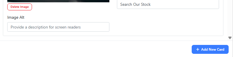
You may then be directed to Add Card via the '+ Add New Card' Button at the bottom:
 A Card will appear below:
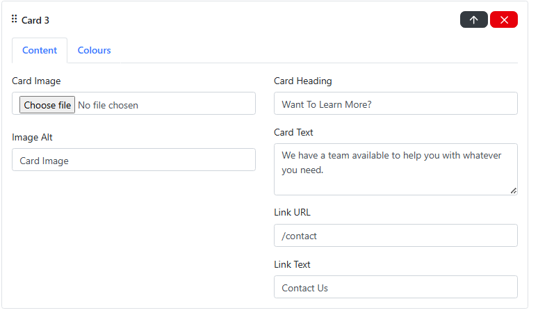
Under the Content tab:
-
Card Heading: the title or headline of your card
-
Card Text: short description that provides additional context for the user
-
Image: the image assigned to this card
-
Image Alt: a short description of the image - important for accessibility reasons and also helps with SEO
-
Link URL: enter the full URL or relative path where users should be directed when they click the card
-
Link Text: text that will appear on the card's button or link
Under the Colours tab, you can select colours for the heading, description and background.
Further Cards can be added via the Green + button
Please see attached video for further clarity
https://res.cloudinary.com/total-dealer/video/upload/v1763085949/Adding_Cards_qtuxvi.mkv